
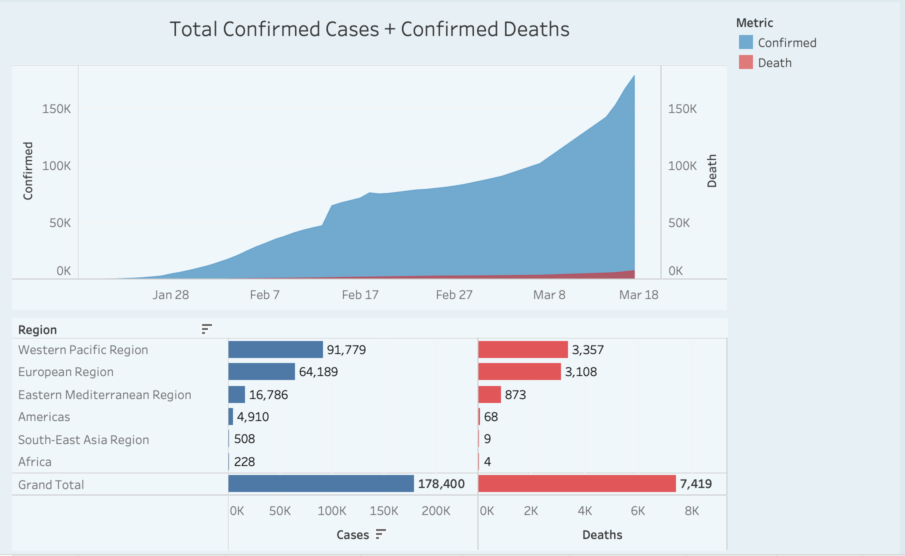
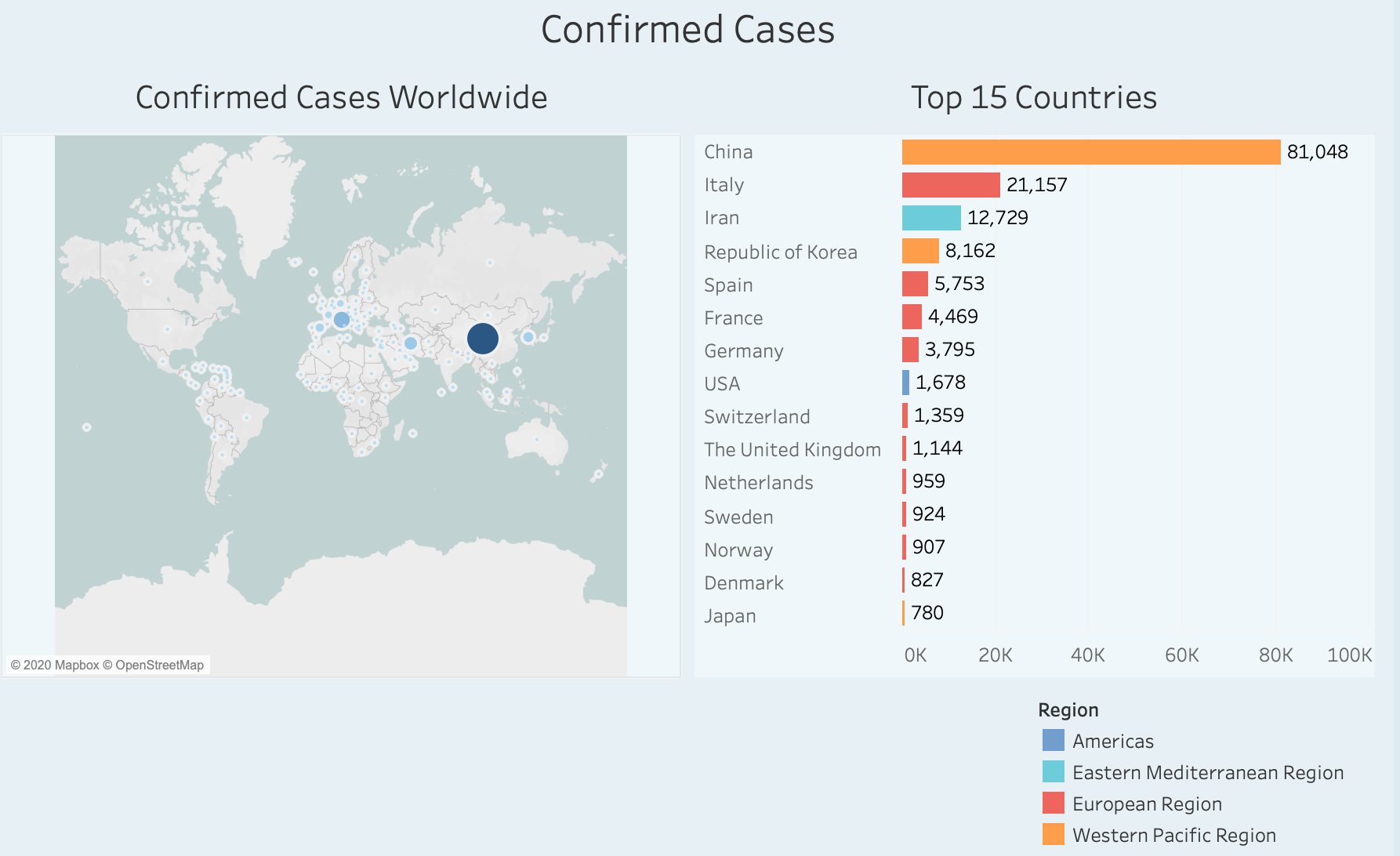
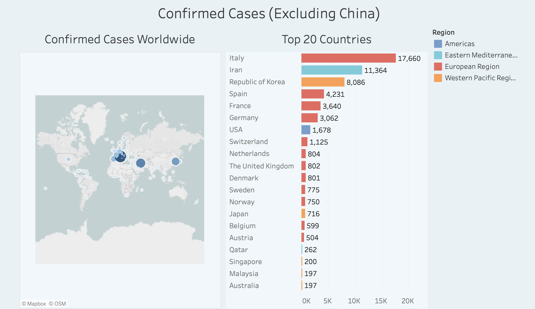
Data gives me peace of mind. Even when data is showing a really negative trend, it gives me a sense of control to know what is going on. So with the Coronavirus pandemic, I decided to spend some time looking at the data from the world health organization and I built a few interactive charts using Tableau public. The news are definitely not good. Especially for those of us in the USA as we are just getting started and the number of confirmed cases is growing exponentially. The death rate in the USA is lower than in other countries -for now – so that is the good news.
Here are some of the visualizations if you are interested…. Just click on Coronavirus Stats, and navigate the charts by clicking on the top tabs.
